A few chunking examples.
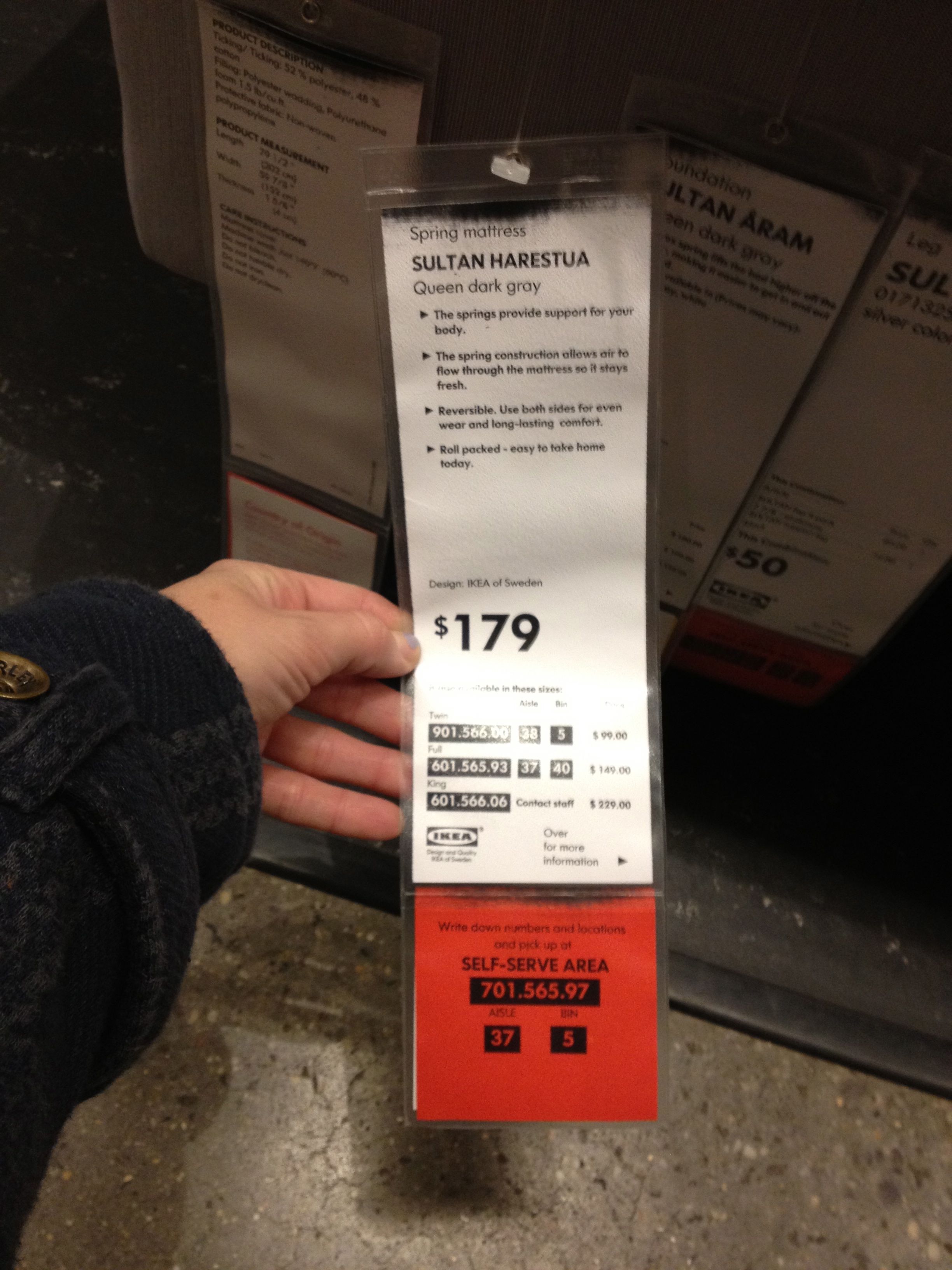
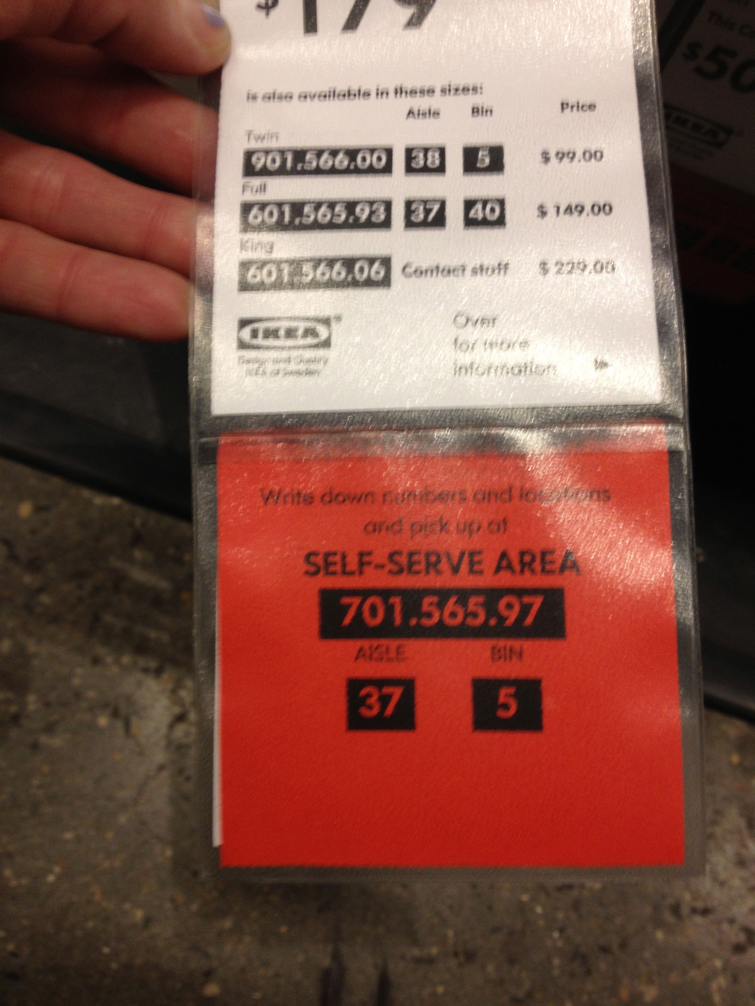
I found a few examples of long numbers (or sets of numbers) that need to be remembered in my everyday life, and decided to group three of them in order from worst to best from a chunking perspective.
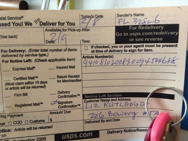
Awful/Nonexistent...
The "we missed you" slip from the mailman. How can he even write all those in a row without losing his place?

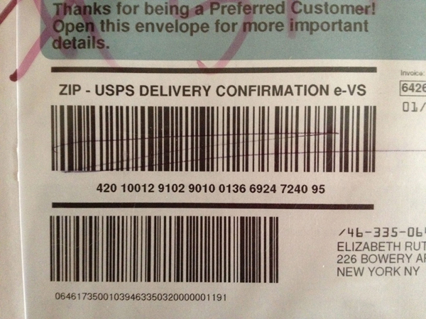
Better...
At least this tracking number is divided into smaller groups!

Great!
I heart Ikea. They not only divide their system by aisles and bins, but visually chunk the numbers even more by enclosing them in boxes.


Learning Styles in Action.
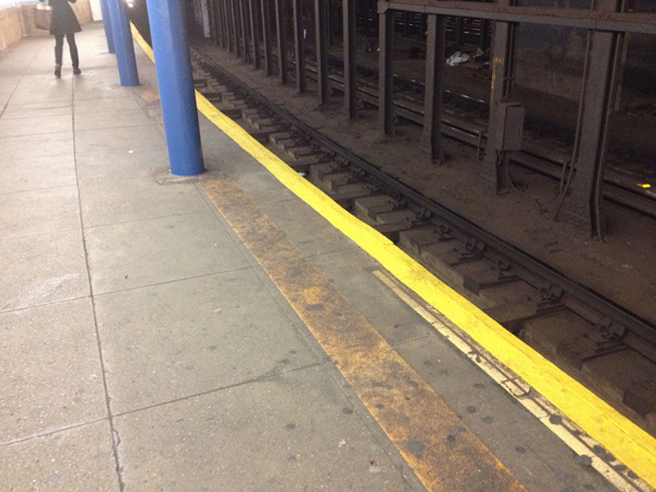
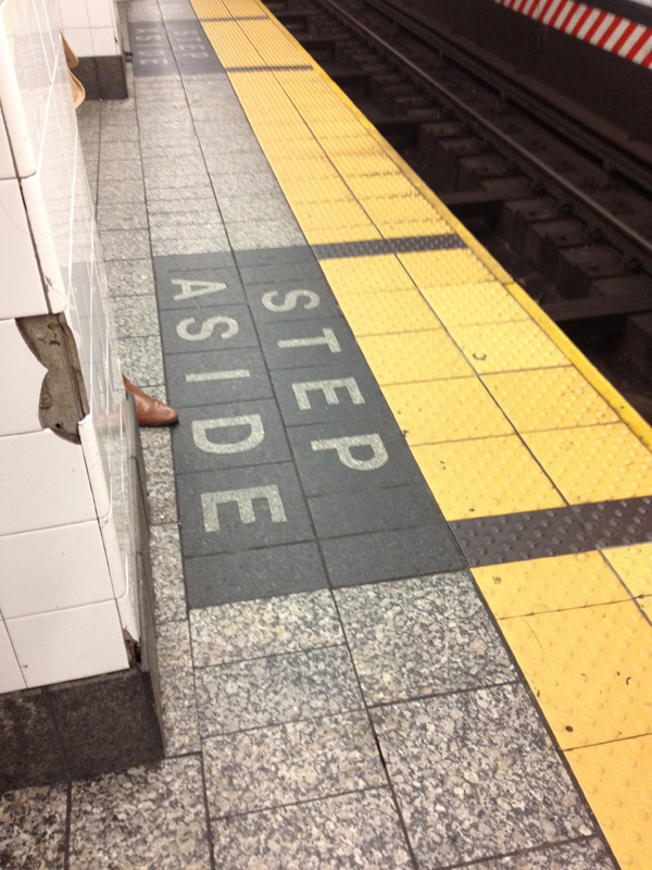
I thought these two images of subway platforms were interesting when looked at through the lens of learning styles. By having the universal color for "caution" consistently along the edge of all platforms, this information (to stay away from the edge) is immediately evident to the visual learner. But there's also something in there for the tactile learner with the texture change—it's not just a line or just a color change, but an actual change in material to alert passengers through multiple senses that they should back up.
Subway platform at the Spring St. (6) Station.

Subway platform at Grand Central Station (4/5/6).

Personal Work Reinterpreted.
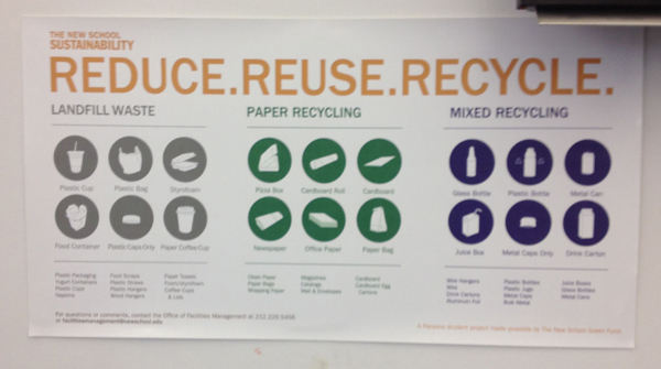
For this assignment I chose a picture that actually didn't make it into my presentation in this exact form: the New School recycling posters that are around the lab at all the trash can/recycling bin sites.

There are several elements that I really like about this poster. The use of icons in general, to simplify the amount of cognitive processing the user has to perform to recognize the objects being described, is very clean and well done. In addition, the way that all the objects are similar but grouped by type through the use of color is also quite nice, and establishes a hierarchy without much extra labeling. (It is clear that these are all "waste items" but that within there we have three different categories. I also like the use of spatial grouping on top of the color differentiation to create more of a divide between the types of items.
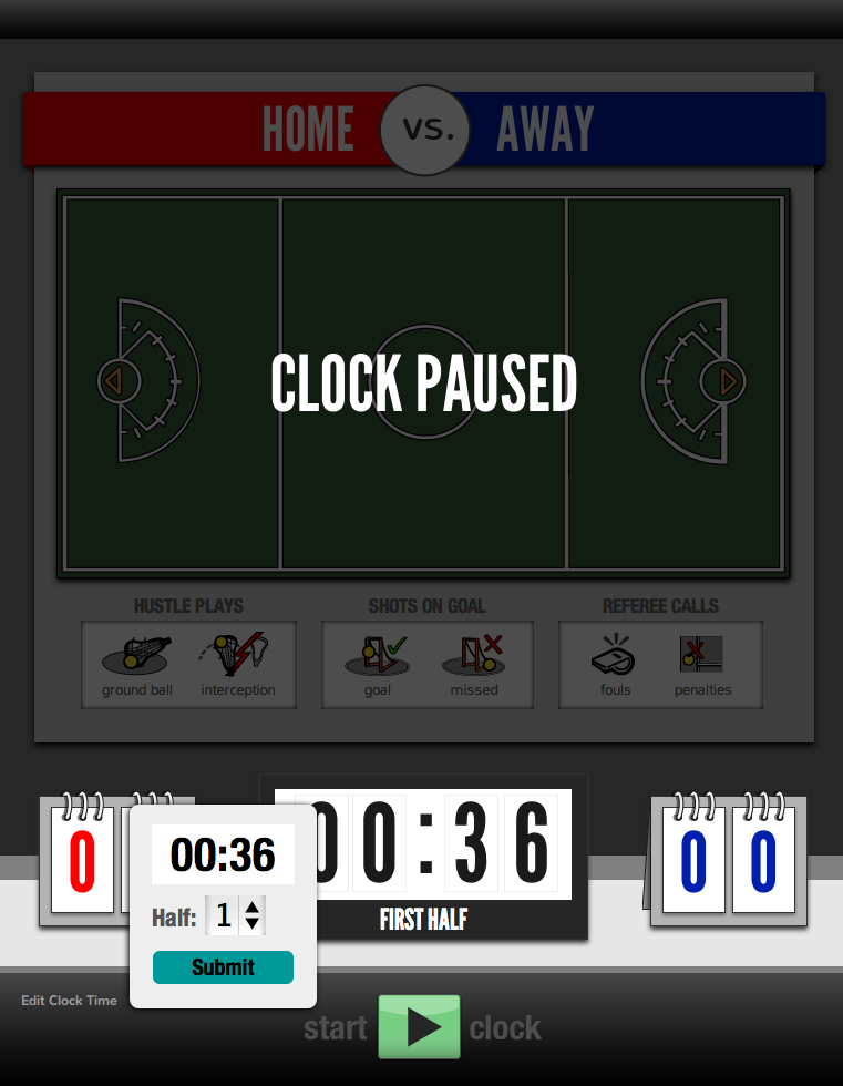
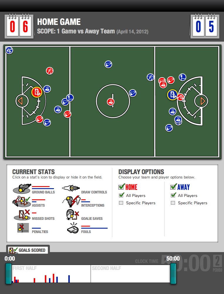
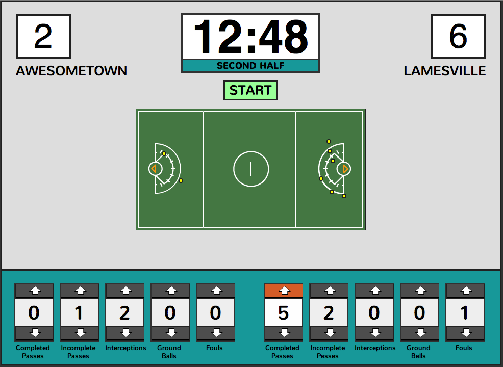
I wanted to apply this example to my own thesis work, so decided to take a crack at my last prototype for a lacrosse scorekeeping application that allows you to count various stats and mark the location of goals on a field. The first version (below) had been done quickly with the functionality, not design, in mind, and as such needed a makeover.
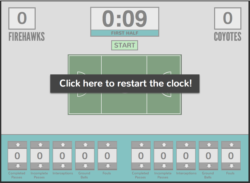
Before.

The buttons for logging statistics were all kind of the same looking and in a row without any type of grouping (other than by team) and were wasting a lot of space by having arrow keys that would rarely be used. In addition, there was really only words and buttons—I hadn't made use of the types of icons that make information so easy to grasp quickly.
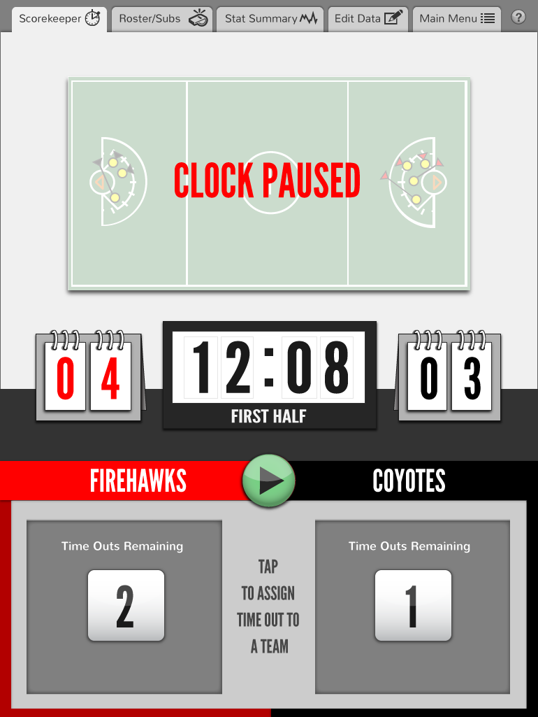
I also had made a grey out screen for when the clock is paused to ensure that nobody would start logging stats without remembering to turn the clock back on, but it looked washed out and I felt like I was missing an opportunity to display SOME information while the game is paused.

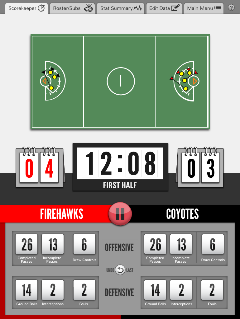
After.
In order to make the stats easier to locate and find intuitively, I grouped them into sub-categories (defensive and offensive), and then sub-categories within THOSE (passes vs an unrelated statistic, and good vs bad statistics, respectively.) The way the stats worked out in groups then dictated the orientation of the entire screen, leading me to turn everything into profile orientation to make the best use of the space. I also made icons for various parts of the interface to help the user quckly recognize different parts of the application and to give it a cleaner look.

To address the pause screen issue, I made the field still dim down and have a warning indicator that the clock is stopped, but still allowed the user to see the score and time on the clock easily, and without visual obstructions. I also made more use of the space by converting the stat "dashboard" into a location to display and record time outs for both teams, making use of a space that I have previously been wasting.

There's obviously a lot more to go as far as developing the entire app, but I was really excited to see how quickly and effectively the simple principles we've been discussing the last two weeks has been able to improve my thesis prototypes!